TerraSana flourishes in new design
“We have improved the brand identity across all product lines”
TerraSana has started a redesign. “TerraSana stands for a healthy earth. The entire new concept tells the story of how TerraSana envisions a healthy earth,” explains Renate Bruins-Haack, Food labelling specialist at TerraSana. It is a soft launch. So it will take some time before we’re done with the entire range. From the beginning of June, the products with the new design will be introduced step by step, starting with the nut butter line. Then follow the compostable bags with basic ingredients (nuts, seeds, superfoods). And all products that will be introduced in the course of this year, such as the fudge, will immediately get the new design.
Giving ‘positive eating’ more meaning
TerraSana teamed up with the agency Bowler & Kimchi last year. ” We noticed that the brand recognition and the impact on the shelf was not that strong at all. The logo was at the bottom of the packaging. Where we previously focused on the product, we now want to bring the brand identity and the story much more to the fore. We took a good look at the different packaging and product lines that we had. Each line (12) had its own look and identity. Now we are focusing much more on brand recognition across all 400 products. Consistency is very important here. For example, the claims are more visible on the packaging. And perhaps most importantly, we wanted to give ‘positive eating’ more meaning.”
Fresh perspectives and new insights
That is why TerraSana has gone back to the core, Renate says. “TerraSana stands for a healthy earth, organic and plant-based food. This should also be reflected in our image. We initially looked very critically at our logo. We involved consumers and new employees. A very different way of approaching your logo and that gave us new insights. The current logo not only evoked the association of the cake with a bite out of it. There were also people who saw an earth that is no longer whole. That is natural exactly the opposite of what we stand for as TerraSana, so we quickly realized that the logo needed an adjustment.”
Leaf
The new logo revolves around the slogan ‘good for the planet and good for the people’, she emphasizes. “TerraSana wants to make an impact by making positive choices. We are creating a planet that thrives, full of biodiversity. We have given the logo more meaning, it stands for a healthy earth. Hence the organically round shape. A leaf has also been added to the logo. The logo now more reflects the philosophy of TerraSana, the soil and the leaf stand for growth, bloom and health.”

Natural heroes together in harmony
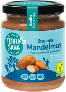
”The story behind the new packaging concept is ‘natural heroes together in harmony’. The concept tells the story of how we work on a healthy planet and how we need each other to realize that healthy planet. We are proud of the products and the people who make our products. They are our ‘natural heroes’. We work together and in harmony with nature and in this way we try to create a planet that thrives and where biodiversity flourishes. This is reflected on our packaging with storytelling elements, such as illustrations such as figures and photos of ingredients.” Renate indicates that he is very happy with this concept. “I am now really seeing TerraSana as a brand in our packaging for the first time. We show much more who we are and what beautiful vision we have.”
Scoop for the nut butters
The first line that comes on the market with the new design is the nut butter line. A conscious choice, since TerraSana produces the nut butters itself. “As a result, we have very short lines and we can switch more quickly. And it is a product we are proud of. We have chosen not to deviate too much from the current colors, especially with the nut butter line. With some other lines we will also try to stay close to the current colors, so that consumers do not miss out on their trusted product in the store. The almond butter labels, for example, are blue and will remain blue in the new design.”
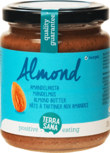
Old design versus new design:


Written by Biojournaal